Portfolio / Case study
KleinCASA: from the brief to the live site
A one-page website in three languages for a company that turns shipping containers into homes. This is how we got there: the directions we tried, the colours, the typefaces, the result.
- Client
- KleinCASA, a brand of Uniko Sagl, Losone (Ticino)
- Sector
- Tiny houses from shipping containers
- Work
- One-page website and custom management panel
- Languages
- Italian, German, English
- Online
- Since 22 September 2026
- Address
- kleincasa.com
01
The starting point
KleinCASA turns shipping containers into high-end homes, built in a workshop just outside Genoa. They wrote to us knowing what they wanted: a single-page website, three languages, and a precise reference for the colours and the way the space is divided.
A reference is a starting point, not a model to trace. The job was to understand what they really liked about that example (the light paper, the thin rules, the framed images) and to build around it a site that was theirs, with their product and their colours.
One page, six sections
About us, solutions, investment, gallery, questions and contact: everything on one scrolling page.
Three real languages
Italian, German and English. German is not an extra language: it is the language of the main market.
Computer and phone, separately
Two layouts, each designed for its own screen, not one that simply shrinks.
02
Four directions, one choice
Before drawing a page we wrote four different directions, each one complete: idea, colours, typefaces, motion. Then we compared them on three questions. Will the client like it? Is it the right design choice? Can it be built well in the time we have?
-
The choice
Swiss editorial
An architecture monograph: linen paper, one-pixel rules, a large light serif, a single ink.
-
Cinematic
A story driven by scrolling, with the photographs as scenes.
-
Architecture catalogue
The closest to the reference: two columns, framed images, panels that open.
-
Workshop
The living module as a piece of engineering, to look at layer by layer.
The first one won, by a whisker over the third. We kept the best ideas from the others.
03
The palette
The colours come from the product, not from a swatch book. Linen is the paper everything rests on. Navy is the ink, the same dark blue as the containers. Red is the colour of the two slashes "//" the client uses in its documents, and on the site it appears only there, as punctuation.
Every pair of text and background was measured, not judged by eye. The number next to a colour is its contrast ratio on linen: above 4.5, text reads well even for people with low vision.
-
Linen
#F3ECE4Page background -
Dark linen
#EAE1D6Two contrasting bands -
Navy
#1C2733Headings, buttons, closing band 12.9 contrast on linen -
Graphite
#2B2B2BBody text 12.1 contrast on linen -
Taupe
#645850Captions and labels 5.9 contrast on linen -
Stone
#C9BDB1Rules and frames -
Red
#B8352AOnly the two slashes 5.0 contrast on linen
How much colour, and where
Linen almost everywhere, two darker bands for contrast, navy to close. Red is a single drop.
04
The typefaces
Two families, each with a job. Cormorant Garamond for the headings: a large, light serif that gives the page the pace of an architecture book. Jost for everything else: a clean sans that stays readable even in the small labels.
// Switzerland, Losone
Le grandi tiny houses
Where Swiss engineering meets Italian craftsmanship.
05
The final site
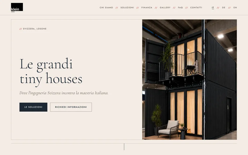
What you see below is the live website, from the first screen to the contact section, as visitors find it on a computer and on a phone.


Scroll inside the window to see the whole page
Open kleincasa.com (opens in a new tab)
From the reference to going live
-
The client shows us their reference.
-
The first working preview, for computer and phone.
-
Final texts and photographs go in.
-
German and English are added.
-
kleincasa.com is live.
06
Behind the scenes: the panel
The site has a management panel written to measure. To change a sentence the client opens the page, clicks on the text and rewrites it right where it appears. The same goes for the photographs, in all three languages.
No heavy systems and no third-party extensions to keep updated: fewer things that break, lighter pages, and the client only touches what they need.
We were genuinely impressed by the efficiency and professionalism of Moesano Web. Lorenzo followed our guidelines closely and delivered exactly the website we wanted.